


Ever feel like you’re flying blind with your website? You’ve put time and money into designing it, but users aren’t converting—and you’re not sure why.
Here’s the truth: If you’re not using heatmaps and analytics together, you’re just guessing.
Heatmaps and analytics are your website’s eyes and ears. They don’t just show you what’s happening on your site—they help you understand why it’s happening. Used together, they form the ultimate feedback loop that can supercharge your website’s user experience (UX).
In this guide, we’ll walk through exactly how to use analytics and heatmaps in tandem to create a smarter, more user-friendly website.
Step 1: Start With Analytics – Find the “What”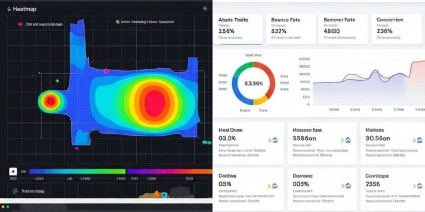

Before you dive into heatmaps, use tools like Google Analytics 4 or Matomo to identify which parts of your site need the most attention.
Identify High-Exit & Bounce Rate Pages
Why it matters: These are your problem pages—where users leave or drop off.
What to do:
- Pull a report of your top-exit pages and bounce rates.
- Flag any page with a bounce rate over 70% (depending on industry).
Example: Your pricing page has a 78% bounce rate. Something’s off.
Analyze Conversion Funnel Drop-Offs
Why it matters: If users aren’t making it through your funnel, you’re losing potential revenue.
What to do:
- Use GA4 or funnel tracking to monitor drop-offs (e.g., product view > add to cart > checkout).
- Note where users abandon the process.
Example: A huge drop between cart and checkout might signal friction like too many form fields or surprise shipping fees.
Review User Flows & Segments
Why it matters: You need to know how users actually move through your site.
What to do:
- Explore behavioral flow charts.
- Compare mobile vs. desktop behavior.
Example: Desktop users complete forms more often, but mobile users bounce on the same page—maybe the form isn’t mobile-friendly.
Step 2: Deploy Heatmaps – Find the “Why”
Once analytics tells you where to look, use heatmaps to discover why users behave the way they do.
Click Maps: What Users Click (Or Don’t)
What to spot:
- Important buttons that are ignored.
- Users clicking non-clickable elements (e.g., an image or word that looks like a link).
What to do:
- Improve CTA design and placement.
- Make expected elements interactive.
Example: Users keep clicking a product image thinking it enlarges—add a zoom feature.
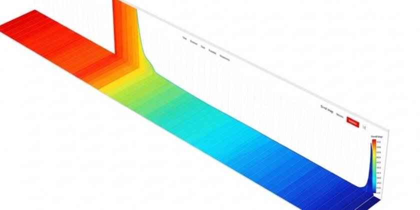
Scroll Maps: How Far People Read
What to spot:
- Where users drop off on the page.
- Whether CTAs are placed too far down.
What to do:
- Move important content and CTAs above the fold.
- Break up long text with visuals or bullet points.
Example: Only 25% of users reach your sign-up button? It needs to move up.
Move Maps: Where Attention Goes
What to spot:
- Where users hover their mouse most (hint: their eyes are often there too).
What to do:
- Align key messaging or offers with high-attention areas.
Example: Hover heat shows users focus on testimonials—move a CTA closer.
Session Recordings: Watch Real Journeys
What to spot:
- Friction points like rage clicks or back-and-forth navigation.
What to do:
- Streamline navigation.
- Fix confusing layouts or slow-loading content.
Example: A user rage-clicks on a disabled button—your design misled them.
Step 3: Take Action – Test, Measure, Repeat
Formulate Hypotheses
Use what you’ve learned:
- “Moving the form above the fold will increase sign-ups.”
- “Adding testimonials near the CTA will reduce drop-offs.”
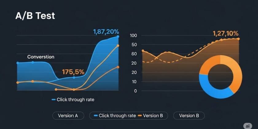
Run A/B Tests
Why it matters: Don’t just guess—validate changes with real data.
Tools: Google Optimize, Optimizely, VWO.
Keep Iterating
- Run new heatmaps post-changes.
- Monitor results via analytics.
- Make ongoing adjustments.
Pro tip: Every UX improvement should be tied to a measurable metric.
Final Thoughts: Ditch the Guesswork
You don’t need to be a mind reader to understand your users—you just need the right tools.
By combining heatmaps and analytics, you gain actionable insights that improve user journeys, increase conversions, and drive growth.
Want expert help interpreting your data and improving your website UX?
Let IxD Hub Help
Ready to optimize your site like a pro?
Reach out to IxD Hub via our Contact Form or WhatsApp to schedule a UX & analytics audit for your site.
We’ll help you Spot hidden issues, Improve engagement, Turn clicks into conversions
FAQs
1. What’s the difference between heatmaps and analytics?
- Analytics shows what users do (e.g., pages visited). Heatmaps show how they behave (e.g., where they click or scroll).
2. Are heatmaps safe for user privacy?
- Yes, tools like Hotjar and Clarity anonymize data and comply with GDPR.
3. How often should I check heatmaps?
- Every 1–2 months, or after major design changes or campaign launches.
4. What’s a good bounce rate?
- It depends on industry, but under 50% is generally solid.
5. Which tools should I start with?
- Google Analytics 4 + Hotjar or Microsoft Clarity are great free options.