Education has changed forever. Today, learners expect the best of both worlds — the personal connection of in-person learning and the flexibility of online classrooms. This model, known as hybrid learning, isn’t just a passing trend; it’s fast becoming the new standard across schools, universities, and training institutes.
But here’s the catch: offering hybrid programs isn’t enough. If your website doesn’t clearly showcase how your hybrid model works, you risk losing prospective students before they even speak to you. A well-designed website is the bridge between curiosity and enrollment. In this guide, we’ll explore how to design a website that not only communicates your hybrid approach but also builds trust, attracts students, and drives admissions.
1. Defining the Hybrid Experience

Before you design your website, define what “hybrid learning” means for your institution.
-
The Blend: How much of your program is in-person vs. virtual? (e.g., “3 days on campus + 2 days online.”)
-
The Purpose: Why hybrid? (Flexibility, access to global resources, balancing extracurriculars, reducing commute, etc.)
-
The Logistics: Which platforms do you use (Zoom, MS Teams, custom LMS)? How do students switch between both environments?
Website Tip: Make this crystal clear in your copy. Avoid vague terms like “flexible learning.” Instead, be specific: “Our MBA program blends 60% classroom sessions with 40% live virtual discussions.”
2. Structuring the Website for Clarity

A confusing site = lost students. Your structure should make navigation effortless.
-
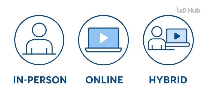
Clear Navigation: Separate sections for “In-Person,” “Online,” and “Hybrid Learning” with distinct icons or color codes.
-
Program Filtering: Allow filtering by learning mode, location, and schedule.
-
Dedicated Hybrid Page: Create a page explaining your hybrid philosophy with visuals, infographics, or even a short explainer video.
Example: A language school in Berlin uses a toggle on its program pages where users can select “In-Person,” “Hybrid,” or “Online” and instantly see program details shift.
3. Showcasing the Learning Experience

A hybrid website should feel alive, not static.
-
Visual Storytelling: Use real images of classrooms, students on Zoom, and blended activities.
-
Program Pages: Always label learning mode upfront (“Hybrid – 2 days on campus + 3 days online”).
-
Testimonials: Let parents, students, or professionals share why hybrid worked for them.
-
Faculty Profiles: Highlight teachers skilled at engaging across both formats.
Example: A coding bootcamp in Singapore embeds a split-screen video: left side shows live classroom coding, right side shows virtual breakout rooms.
4. Technical Foundation

If the site crashes or feels clunky, trust is gone.
-
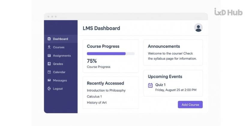
LMS Integration: Sync your site with Moodle, Canvas, or your platform of choice.
-
Mobile First: Assume most users visit on smartphones.
-
Seamless Enrollment: One-click sign-up, easy payment gateways.
-
Reliable Performance: Speed matters — a 2-second delay can cut conversions by 40%.
5. How AI Can Help Your Hybrid Website

AI isn’t replacing teachers, but it can elevate the hybrid experience.
-
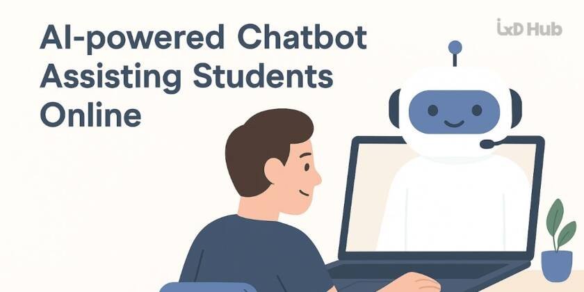
Chatbots: Answer FAQs 24/7 (“When are on-campus sessions scheduled?”).
-
Personalization: AI can suggest courses based on browsing history.
-
Smart Analytics: Track how visitors engage with hybrid pages, then optimize.
Example: Some universities use AI-powered virtual assistants that guide parents through admission steps, reducing call center load.
6. Conversion-Focused CTAs
Your website should guide learners toward action:
-
“Explore Hybrid Programs”
-
“Book a Free Hybrid Demo Class”
-
“Chat with Our Admissions Team on WhatsApp”
Pro tip: Use floating CTAs (e.g., a WhatsApp button on every page) to capture leads quickly.
Conclusion
Designing a website for hybrid learning isn’t just about good looks. It’s about trust, clarity, and accessibility. From defining your model clearly to showcasing real experiences, leveraging technology, and guiding visitors with smart CTAs — your website can make or break student decisions.
At IxD Hub, we help schools, colleges, and edtech brands design digital-first websites that truly reflect their hybrid identity.
Need help creating or revamping your hybrid-ready website? Contact us today via form or WhatsApp.
FAQs on Hybrid Learning Websites
Q1. How do I explain hybrid learning to parents who are new to it?
Use clear visuals (charts, infographics) and a short explainer video.
Q2. Should I create a separate landing page for hybrid programs?
Yes. It helps reduce confusion and improves SEO.
Q3. How can I make my hybrid site stand out from competitors?
Focus on storytelling — real student journeys, transparent schedules, and immersive visuals.
Q4. Is AI necessary for hybrid websites?
Not mandatory, but tools like chatbots and personalization improve user experience and reduce workload.
Q5. How do I capture more leads from my hybrid site?
Add clear CTAs, free demo class sign-ups, and WhatsApp integration for instant queries.


